Banking · iOS & Android
Authenticator 4.0
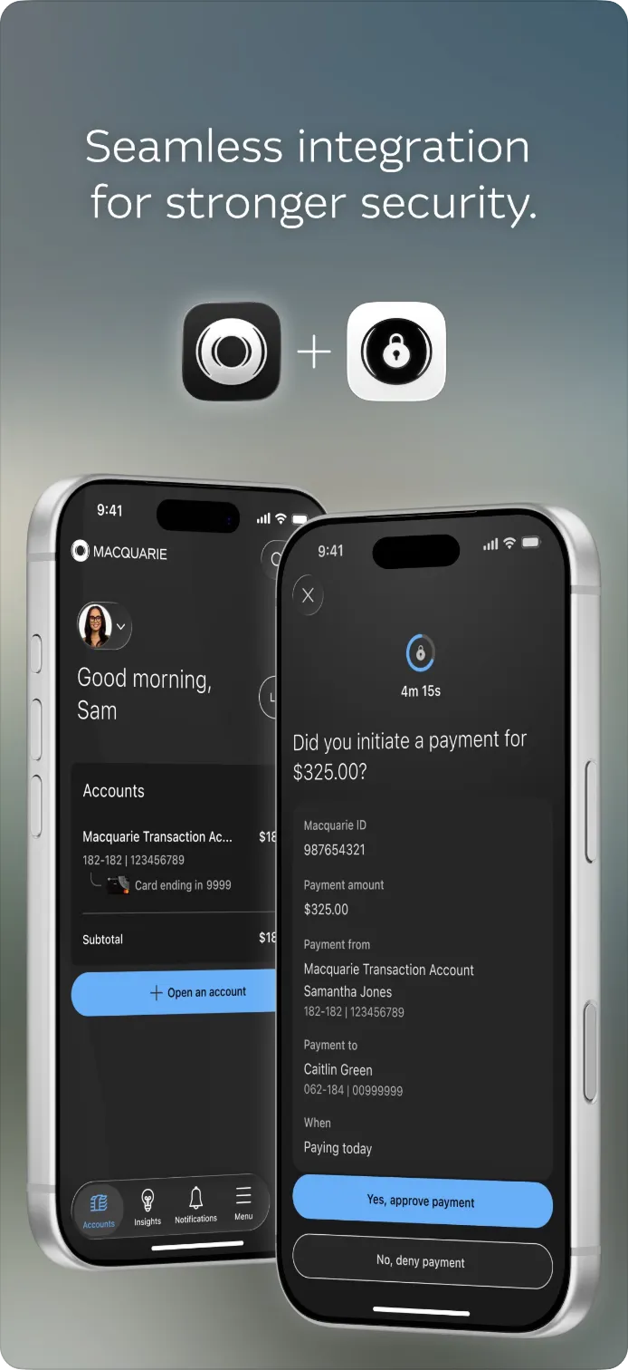
Redesigning the app 1.5M Macquarie clients use to approve every login and payment.
Summary
TL;DR
Macquarie’s Authenticator felt dated, and every channel had bent it differently. I kick-started the redesign, owned the challenge-template system and Macquarie ID+ flows, and helped a new designer lead discovery. We shipped one experience across three builds, first on iOS Liquid Glass.
- eBanking NPS, two months after launch
- +12 pts
- weekly calls about Authenticator
- −17%
01 — Context
One app, five channels, security first
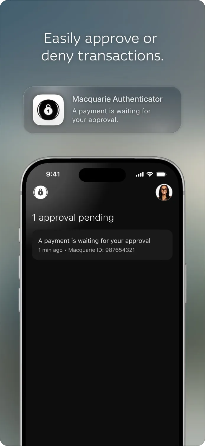
Authenticator is the second factor for every Macquarie channel: personal and business banking, advisers, brokers and wealth white-labels. Security came first. Fraud wanted friction, and rolling codes were being removed because scammers were talking clients into reading them out. Under the hood, a legacy MFA platform meant every new challenge screen needed an app release.
- app for every channel
- 1
- channels and cohorts
- 5
- builds: iOS 26, iOS 16–18 and Android
- 3
- challenge templates
- 74
02 — Problem
Friction for clients, an opening for scammers
Authenticator was meant to protect clients, but it was creating friction at every step and was losing ground against evolving scams.
1. Clients didn’t see why they needed it
Clients had to download a separate app without understanding the benefit. People who already used Google Authenticator or Authy saw it as redundant, and app store reviews said so repeatedly.
2. Setup was a barrier
Many clients got stuck at the start. Scanning QR codes, enabling push notifications and entering rolling codes were all common pain points.
3. Push notifications didn’t work as intended
During onboarding, clients often skipped turning on push notifications and the training simulator. As a result, the system never registered push as their MFA preference. Those clients weren’t alerted when they triggered an activity. Unless the app was already open, they’d only find out by logging in and checking their task list. Other clients said push was hard to enable or didn’t work at all. One wrote:
“Push notifications are enabled on my device but the app tells me otherwise.”
4. The app felt unreliable
Reviews consistently described the app as hard to navigate, unintuitive, buggy and slow.
5. The scam landscape had shifted
Scammers were socially engineering clients into handing over their codes, then using those codes to log in through phishing sites. In response, the team decided to remove codes from the app entirely.
03 — Key decision
One challenge template for every channel
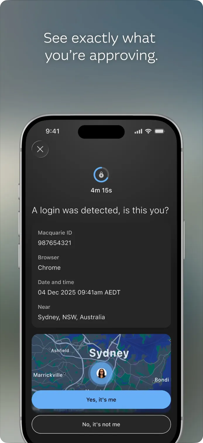
Over the years, each channel had grown its own approval screens: 74 templates with all-caps details, a mix of questions and statements, and different button labels. I’d started auditing them before the project kicked off, so this became my stream. We weighed three options.
- Option AReskin each channel
Fast, but keeps every inconsistency.
- Option BServer-driven template
Ideal: no app release per template. Blocked by platform investment and unclear ownership.
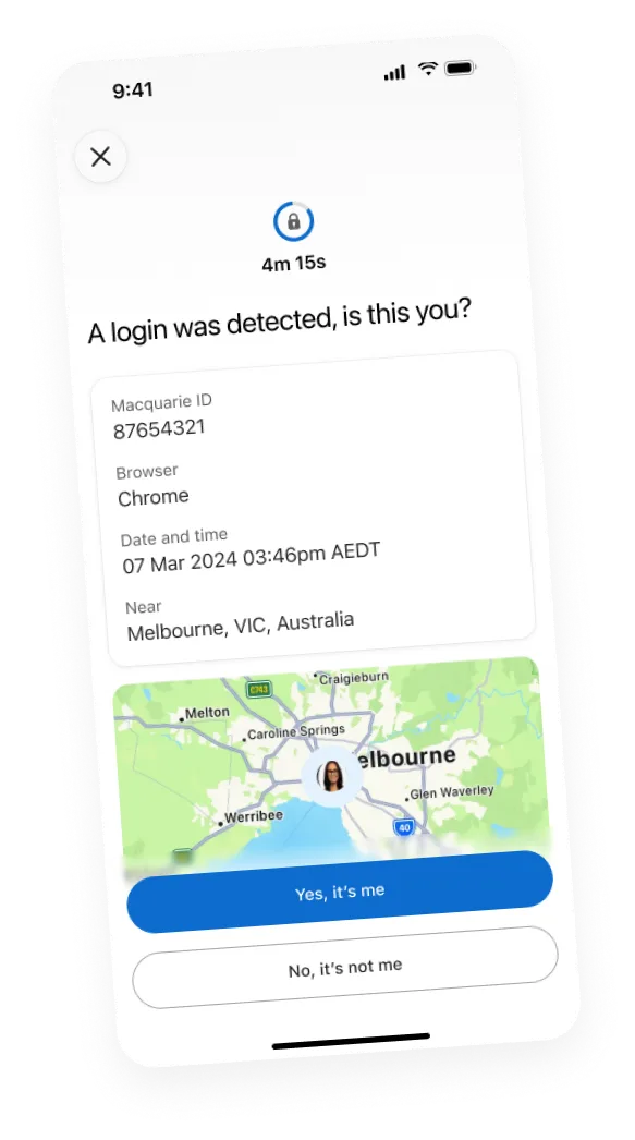
A shared anatomy: question headline, key details first, timer ring, Approve or Deny.
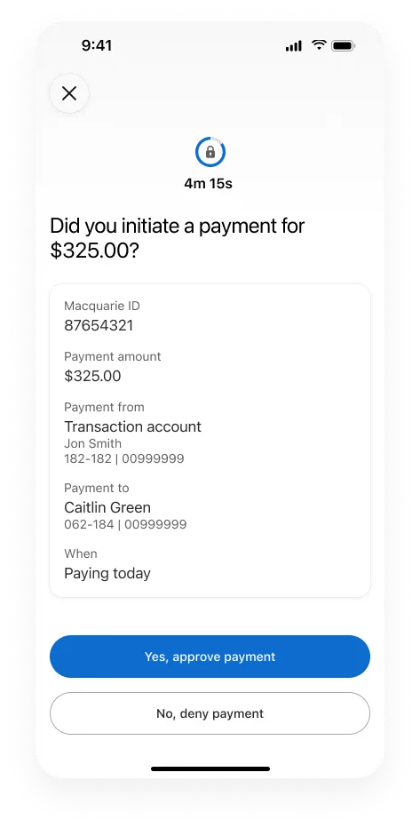
I chose C because it fixed the client problem now, without waiting on platform work, and every channel inherits each fix. The trade-off: new templates still ship with an app release, and most copy stayed unchanged to protect scope. I also kept these time-critical screens free of “delight” effects like glows. When you have minutes to approve a payment, clarity wins.
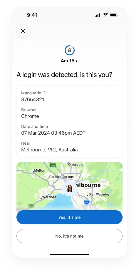
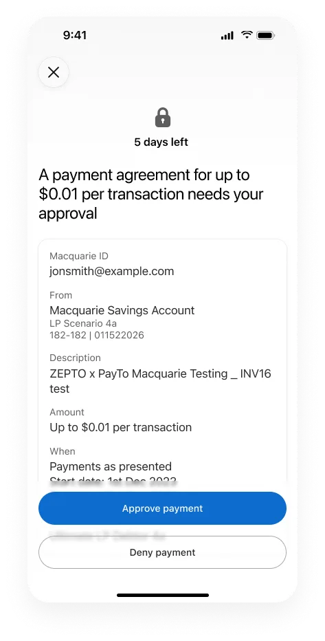
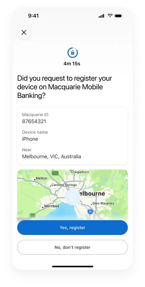
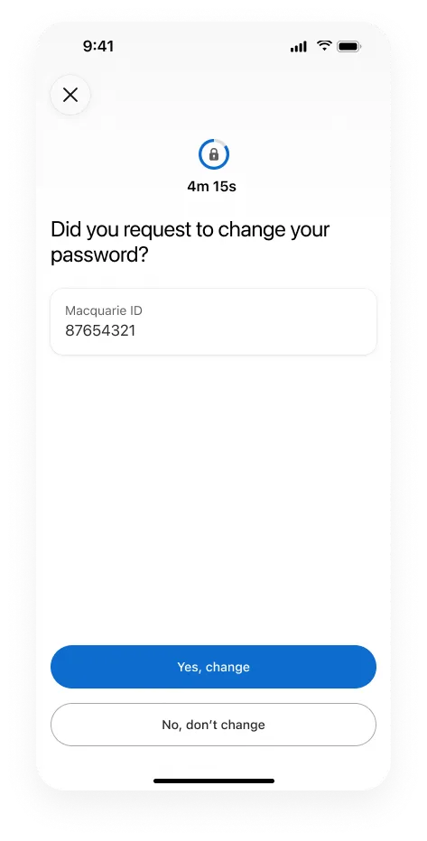
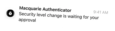
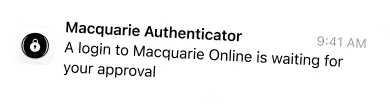
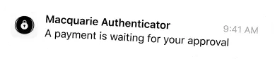
Same anatomy, different jobs: five of the 74 templates rebuilt on one pattern.
04 — Key decision
Liquid Glass, without leaving anyone behind
Halfway through, Apple announced Liquid Glass, and the business wanted to be the first bank to ship it. Going Liquid Glass-only would have been fastest, but it would have left older iPhones and every Android user on the dated app.
- Option AStay on plan
Finish 3 testing rounds first. Safe, but misses the moment.
- Option BLiquid Glass only
Fastest, but splits the client base.
iOS 26, iOS 16–18 and Android designed together.
We designed all three builds from one set of patterns, with native details where they matter. I owned the Android and Macquarie ID+ flows across all three. Speed had a cost: usability testing was compressed.
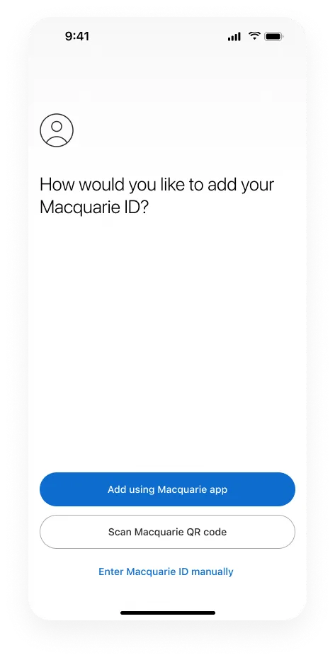
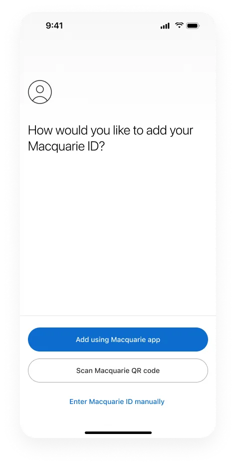
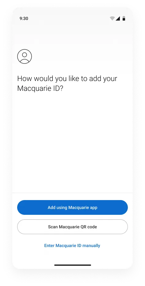
One step, three builds. On iOS 26 the actions float over the screen, iOS 16–18 keeps them on a bar with a divider, and Android uses Roboto and its own system bars.
05 — Solution
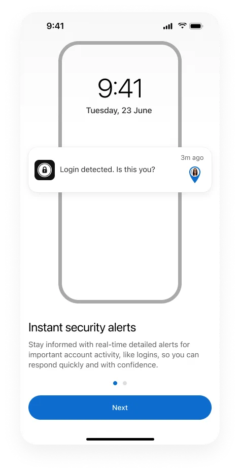
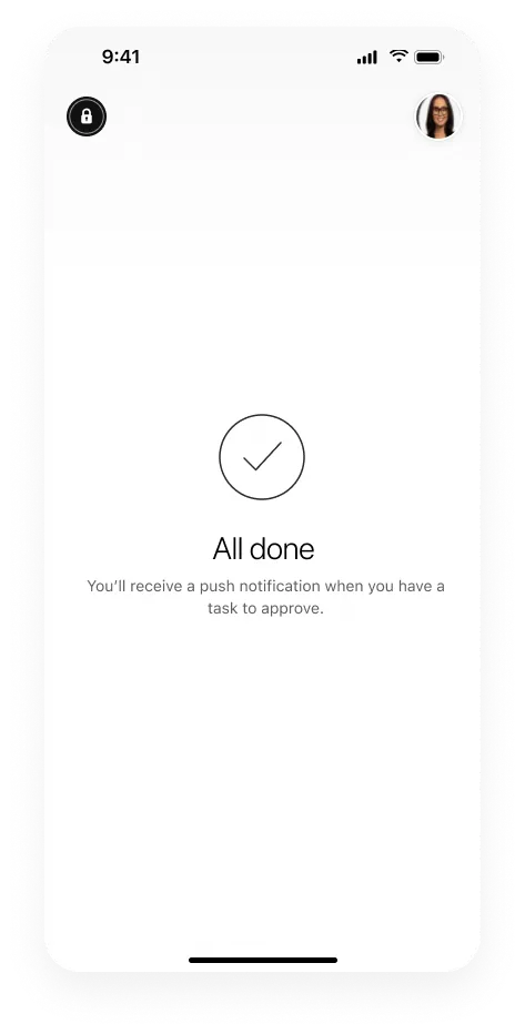
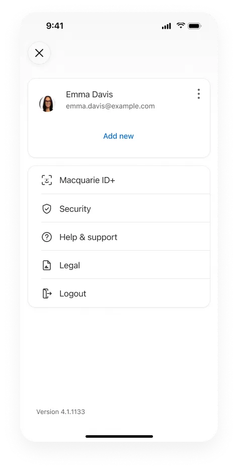
Every screen has one job
The result is a calmer app that explains itself, shows exactly what you’re approving, and never asks for a code a scammer could steal.
06 — Impact
Easier to use, cheaper to support
Authenticator 4.1 was a UI-only release, so the change is down to the design. Two months after launch:
- eBanking NPS, up 12 points
- −11.8 → +0.2
- mBanking NPS, up 6 points
- 42.3 → 48.3
- active Authenticator users, up 4.5%
- +65K
- weekly calls, after a short launch spike
- −17%
Before“The Authenticator process is too difficult.”
After“Easy to set up. Easy to navigate… Makes me feel safe.”
A forced app upgrade overlapped the launch period, and calls only dropped once it had settled. Source: Medallia, ThoughtSpot.